
How I Get Consistent AI-Generated Featured Images for Every Blog Post
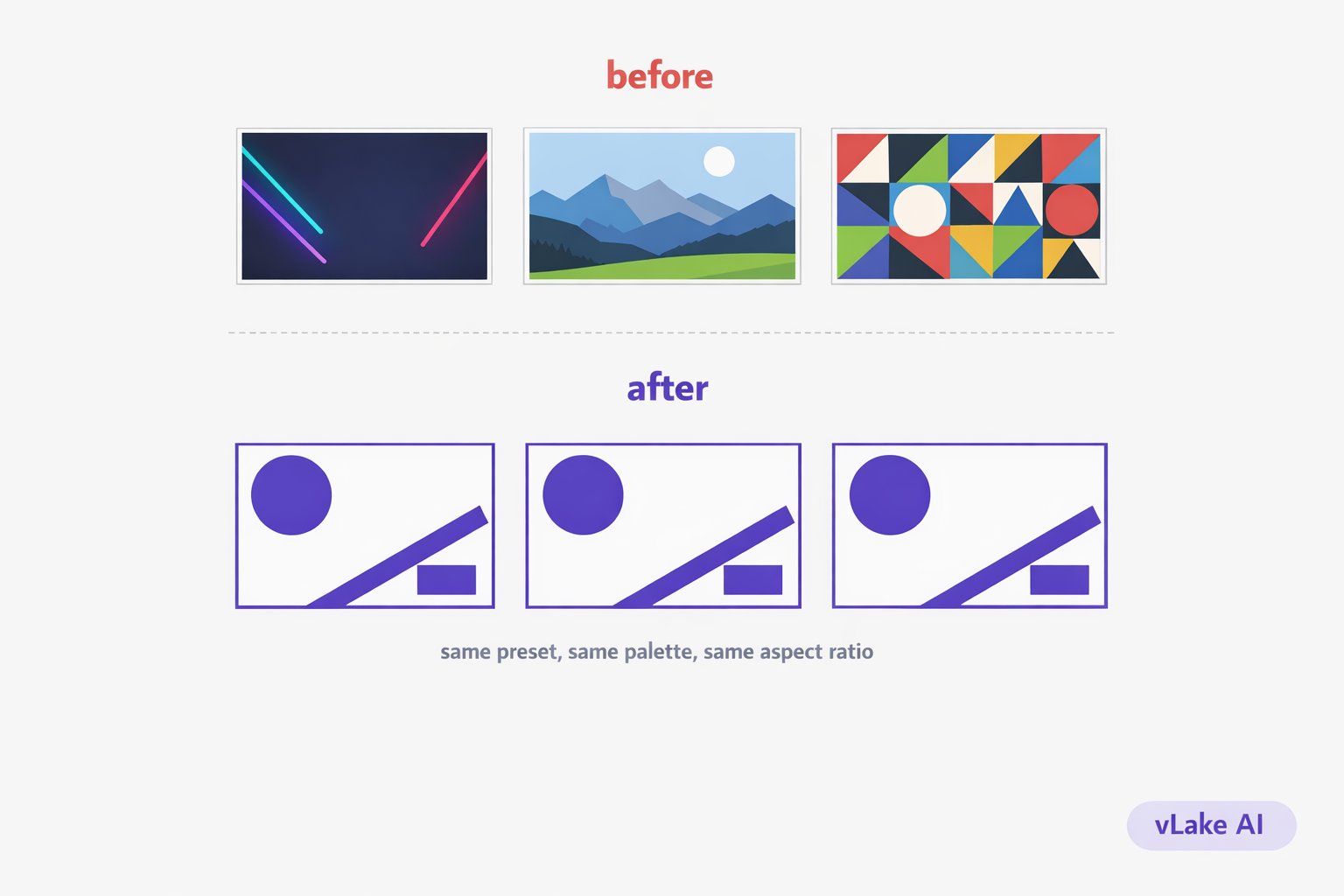
My blog looked like six different websites. One post had a stock photo of a laptop with a coffee cup. The next had a flat-design infographic. The one after that had a dark, moody AI illustration with neon gradients. The featured image for my most popular post was a screenshot I cropped in Paint.
Every image was fine on its own. Together, they looked like they belonged to different brands. When someone landed on the blog archive page, there was no visual thread connecting anything. It looked chaotic.
I fixed it by generating every featured image with the same AI style preset. Took one decision, applied it everywhere, and the whole blog suddenly looked like one publication instead of a collage.
The Consistency Problem
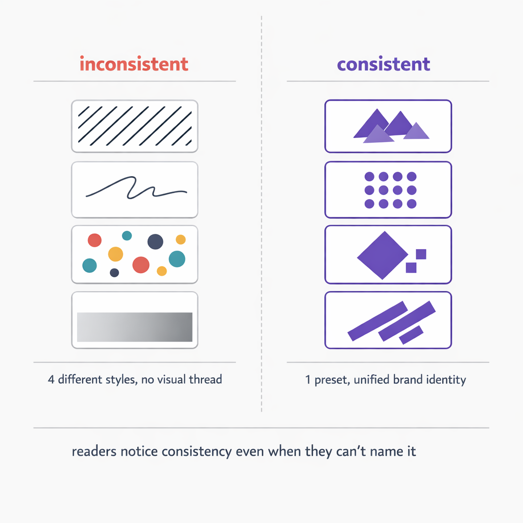
This happens gradually. Most blogs do not start with a visual style guide for images. You grab whatever looks good for each post and move on. Over months, the visual library becomes a mix of:
- Stock photos from three different sites (different lighting, different composition styles)
- AI-generated images from different tools with different default aesthetics
- Screenshots and diagrams made in different editors
- Freelancer-created graphics that match a brief but not each other
The result is a blog that has no visual identity. Readers notice this, even if they cannot articulate what feels off. A blog that looks consistent signals professionalism and intentionality. A blog that looks random signals… random.
This matters more than most people think. Featured images show up in blog archive pages, social media link previews, Google Discover cards, email newsletters, and RSS readers. The featured image is often the first thing a potential reader sees before deciding whether to click. If every image looks like it came from a different source, the blog does not build visual recognition over time.
What Consistent Means in Practice
Consistent does not mean identical. It does not mean every featured image is the same template with different text. That gets stale fast.
Consistent means:
- Same style preset. Every image uses the same visual language. If you pick flat design, every image is flat design. If you pick line art, every image is line art. No mixing isometric 3D on one post with watercolor on the next.
- Same color palette. A defined set of colors that show up across all images. Not every image uses every color, but nothing introduces a random color that is not in the palette.
- Same aspect ratio. Featured images are always the same dimensions. No mixing landscape and square. This keeps the archive page grid clean.
- Same level of detail. All images have roughly the same visual density. No alternating between a simple icon illustration and a packed infographic.
The visual system I settled on: flat design preset, brand palette (purple, coral, charcoal, near-white), 1536×1024 landscape for all featured images. Within that system, each image is unique. Different compositions, different focal elements, different data. But they all look like they belong together.
The Setup
Setting this up in vLake took one decision and about five minutes.
I chose the `flat_design` style preset for all featured images. vLake supports 17 style presets, but the key is picking one and committing to it. Flat design works well for editorial SaaS content because it is clean, readable at small sizes, and does not compete with the blog text for attention.
I locked the aspect ratio to `1536×1024` for every featured image. This is the landscape format that works for blog archive thumbnails, social media cards, and link previews.
For the prompt pattern, I established a consistent approach: describe the central concept of the post as a visual, include the brand colors by hex code, specify the layout and text that should appear, and end with the same style instructions. Each prompt is different because each post is different, but the structural bones are the same.
When I generate a new blog post through vLake, the featured image can be generated inline as part of the same operation. I do not need to generate it separately, download it, and upload it. It is part of the blog creation flow.
Before and After
The difference is visible on the archive page. Before, scrolling through the blog felt like browsing a folder of random images. After, it feels like looking at a magazine.
Some specific changes I tracked over three months:
| Metric | Before | After |
|---|---|---|
| Featured image creation time | 20-45 min | 5 min |
| Visual style consistency | mixed (4+ styles) | single preset |
| Social media click-through rate | 1.8% | 2.7% |
| Blog archive bounce rate | 68% | 54% |
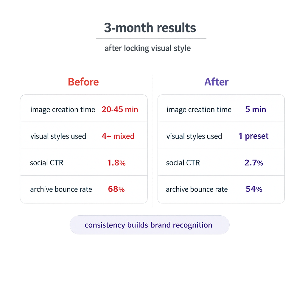
The click-through rate improvement surprised me. When I shared posts on LinkedIn and Twitter, the consistent visual style made my posts immediately recognizable in the feed. People started associating the purple flat-design style with my brand. That recognition is worth more than any individual image.
The bounce rate drop on the archive page makes sense in retrospect. When every featured image looks professional and cohesive, readers are more likely to click through to a second post. The visual consistency signals that there is a real publication here, not a random collection of one-off articles.
What I Would Tell Someone Starting Out
Pick a style preset. Any preset. The specific choice matters less than the consistency of applying it. Flat design, line art, isometric, illustration. All of them look professional when used consistently. None of them look professional when mixed randomly.
Lock your featured image aspect ratio. Do not change it between posts. Your archive page and social cards will thank you.
Write your prompts with the same structural pattern. Different content, same approach. This is what gives you variety within consistency.
And generate the featured image as part of the blog creation flow, not as a separate afterthought. When the image is baked into the publishing process, consistency becomes automatic instead of aspirational.